Design Process
Young professionals are often forced to change residence amidst busy work lives due to the nature of their jobs. This means they have to get rid of stuff that cannot be moved along to the new apartment. Platforms for re-selling old stuff come across as saviors in such situations. They not only help you get rid of big items, they also help you buy quality furniture, kitchenware, etc. at affordable prices! Everyone loves two words when they want a piece of furniture in or out of their home - ‘hassle free’.
We are building Azure preloved web store using these two words as our motto.
Persona
Interviewing working professionals from different walks of life and asking them about their experiences of changing living spaces frequently with each job change, led me to Fatima. She is a persona representing the user group which has the most to gain from Azure preloved.

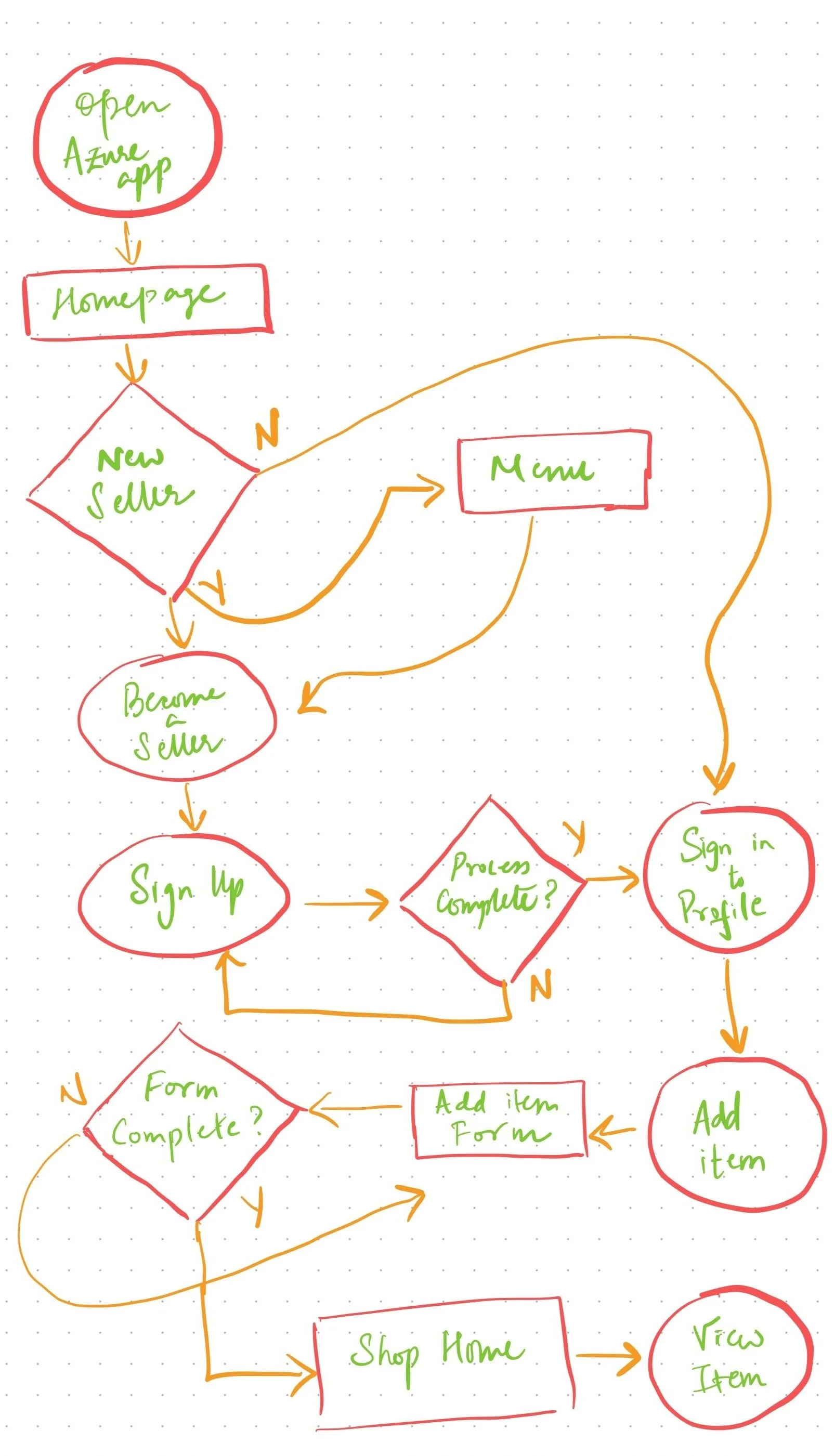
User Flow
I was aiming for a simple user flow with two ways of reaching the sign-up page for sellers. Options available are prominent and steps are intuitive.
Goal Statement
Azure preloved app will let users buy & sell second hand items which will affect busy professionals who wish to sell and shop for pre-loved items in a hassle free manner by providing them with a trustworthy, easy to use platform. We will measure effectiveness by the number of seller sign ups per month.
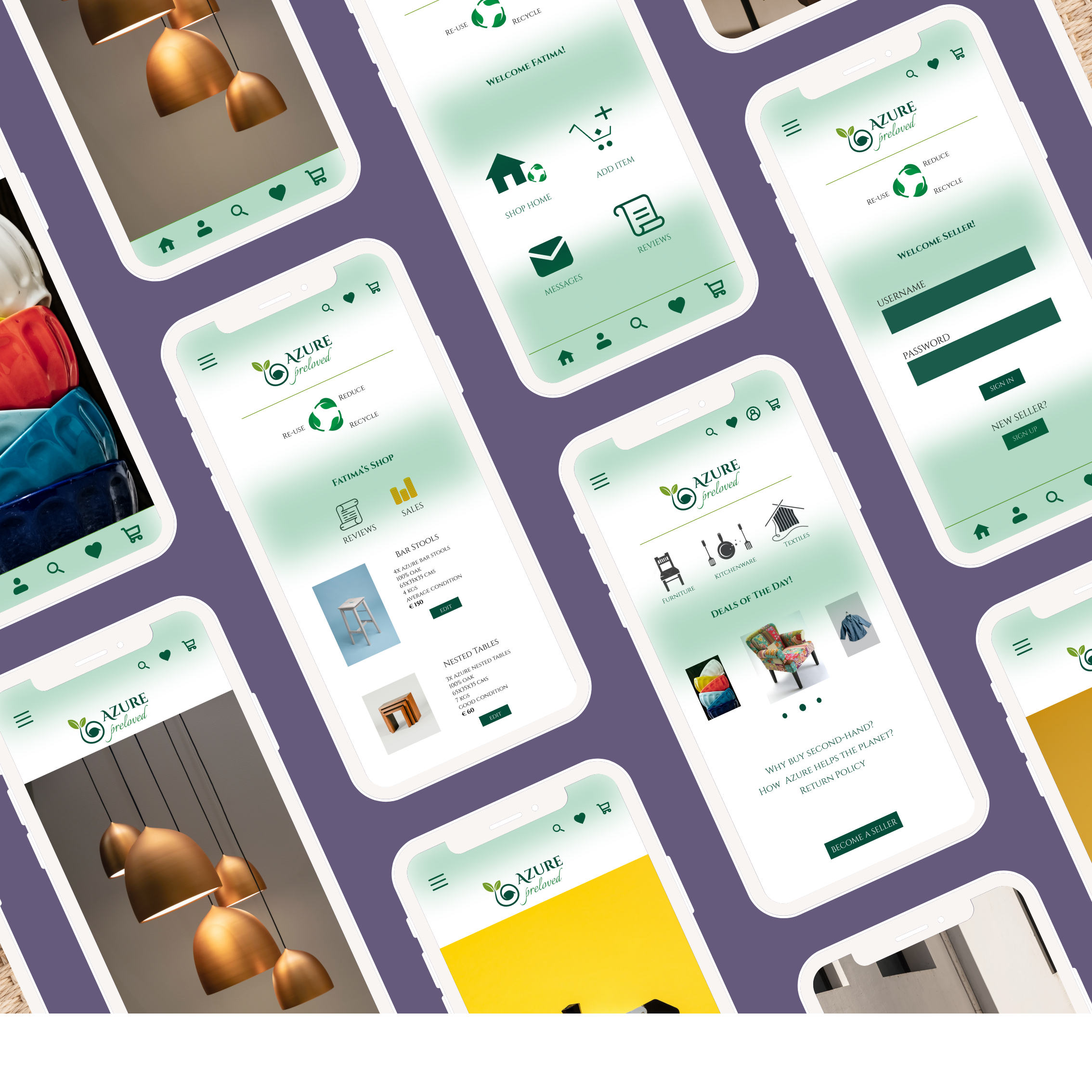
Wireframes
With the user flow and the goal statement in place, it was time to get cracking on the wireframes. I started off brainstorming with paper wireframes, placing the Azure logo at center stage so that users identify the new app with the trusted brand. However, in order to increase the company’s perception as an environmentally conscious brand, there needs to be some graphical message on the landing page.
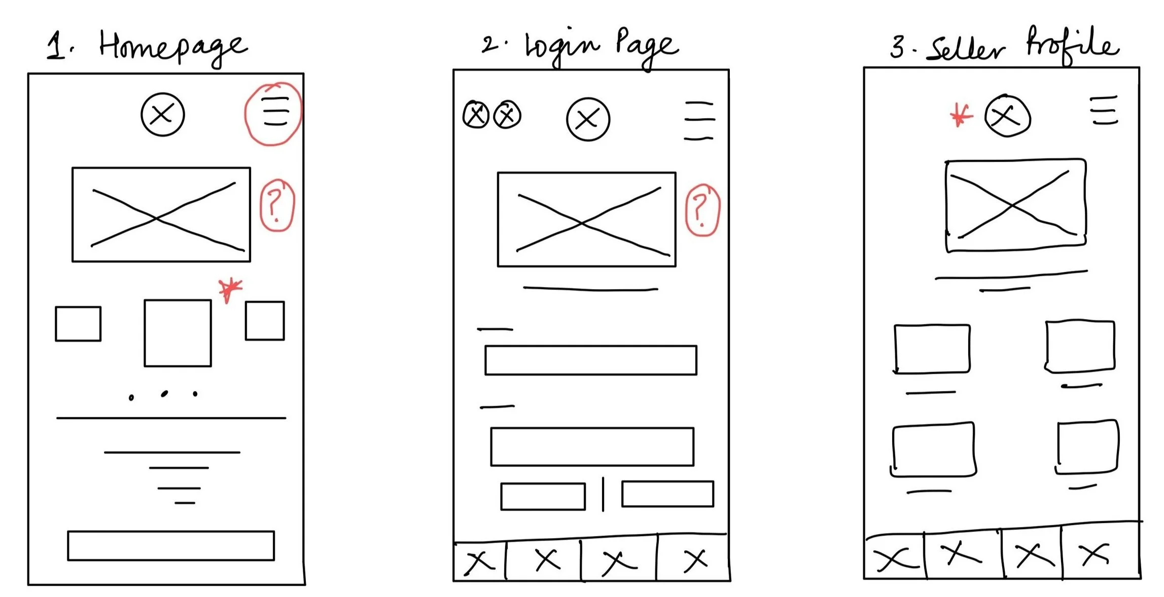

Lo-Fi Wireframes
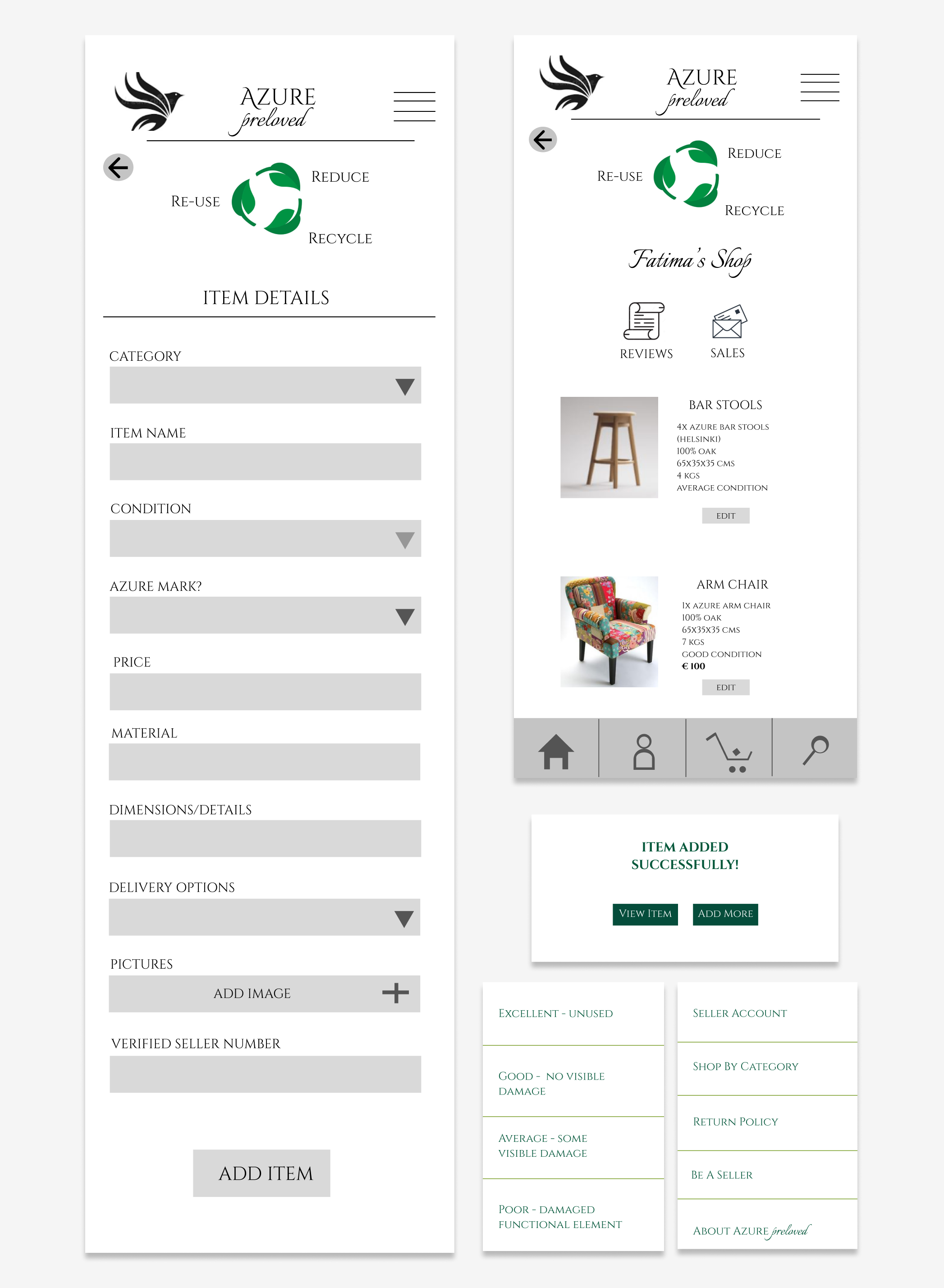
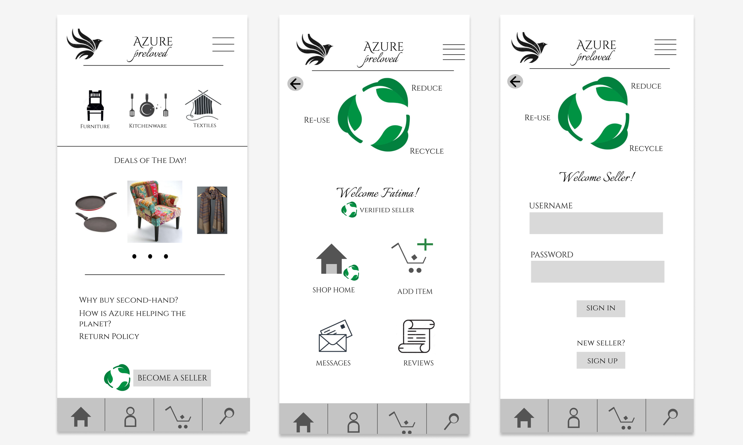
All the decisions were taken with the initially defined challenges in mind. By creating the membership concept, we hope to get in new users and keep the existing ones engaged. Return policy is clearly mentioned and placed close to the ‘become a seller’ button. Adding items to sell has a detailed scroll down menu with easy extensions to add pictures.
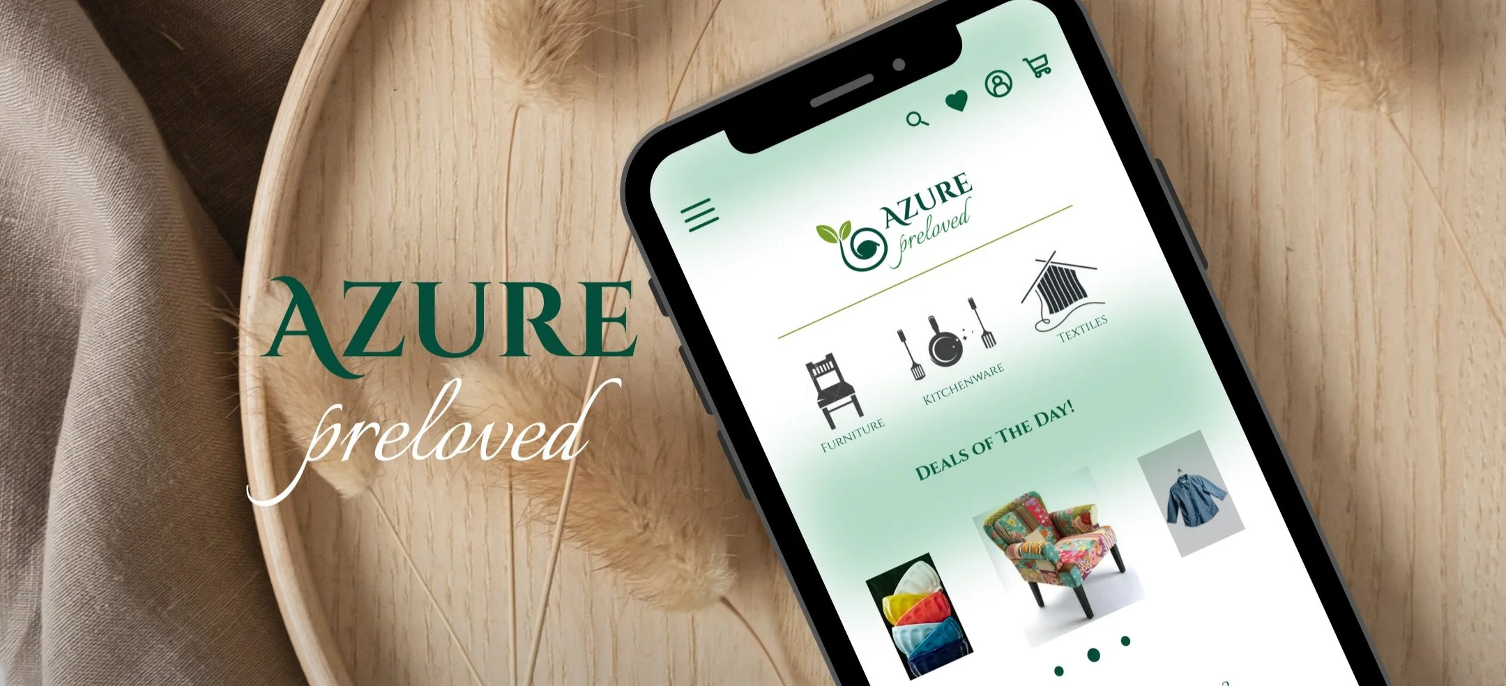
Final Look & Thoughts
Look for inspiration in the real tangible world
How users navigate situations in the real world is a lot similar to how they expect things to go online. So even if they do not know what they want in an app, they sure have a narrative and preferences in their real-life dealings. Look closely.
The impact of colors
Changing the colors on the Hi-Fi porotypes of the app and looking at people’s corresponding reactions to them opened my eyes to not only how colors affect moods, but also how they influence decisions.
For future projects, I will delve deeper into color theory.